
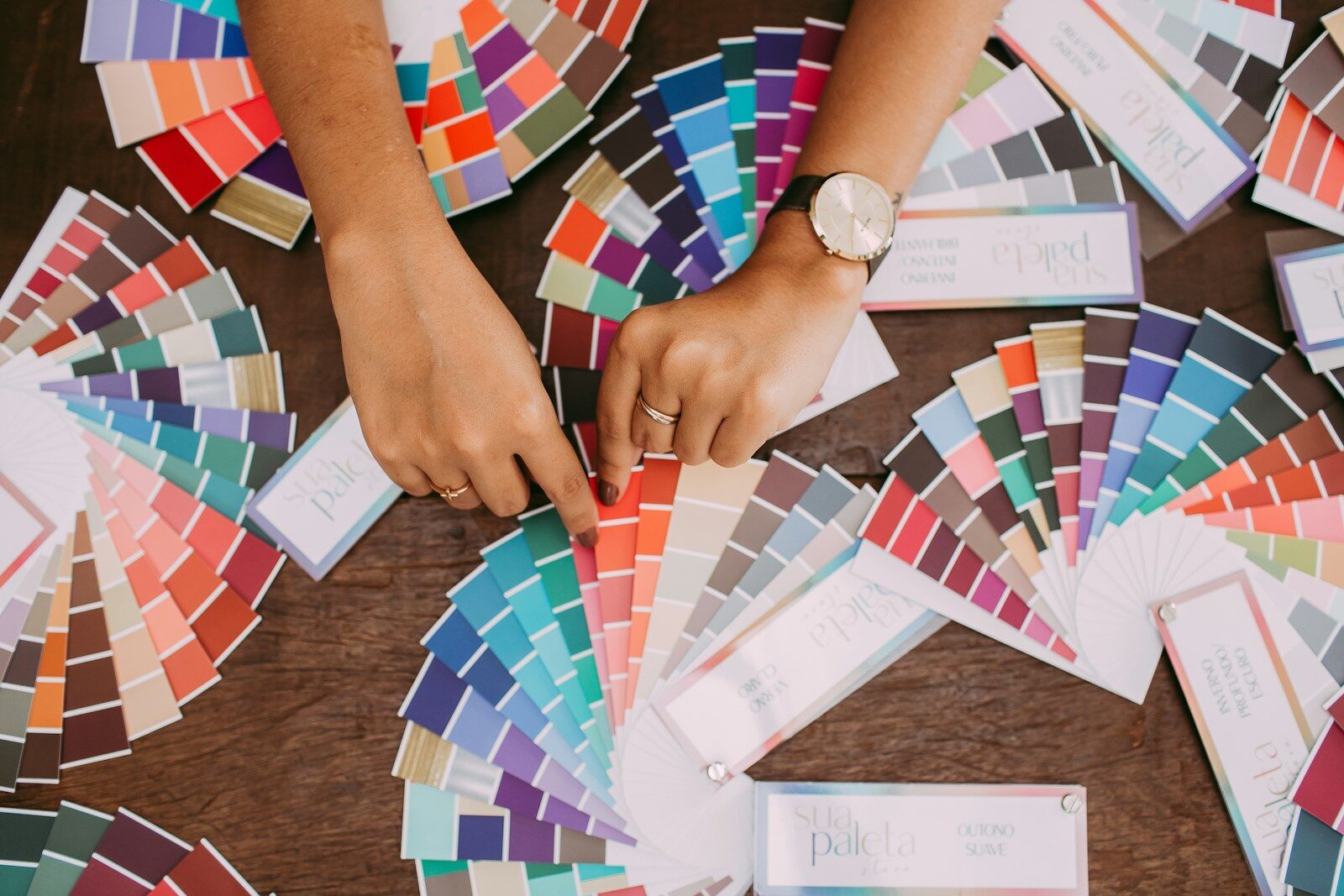
Choosing a colour scheme for an event is about more than deciding which shades look good together. The right palette can influence the atmosphere, complement a venue and give everything from the invitations to the table settings a sense of purpose. As planners look ahead to 2027, expect event styling to explore more expressive combinations, tactile finishes and colours that feel connected to nature.
Earthy Colours With a Sophisticated Edge
Natural shades continue to offer plenty of inspiration, but they need not be limited to muted beige and sage green. Think rich olive, clay, warm terracotta and deep chocolate brown, balanced with soft ivory or brushed gold. These colours work particularly well for corporate dinners, autumn weddings and private celebrations where understated luxury is the aim.
They can also be introduced through different materials rather than relying entirely on flowers or coloured fabrics. Wooden details, textured linens, ceramic tableware and warm lighting help build a layered look that feels considered without becoming overcomplicated.
Unexpected Colour Combinations
For events that need a little more personality, contrasting shades can make a memorable impression. Deep burgundy paired with blush pink, cobalt blue against warm orange, or butter yellow combined with chocolate brown can create a distinctive visual identity.
The key is to give each colour a role. One might dominate the room, another could appear in floral arrangements, and a third might be reserved for smaller details such as stationery, napkins or decorative accents. This keeps the scheme cohesive while allowing individual elements to stand out.
Metallics, Texture and Light
Metallic finishes remain a useful way to add glamour, particularly for awards evenings, product launches and formal celebrations. Rather than covering every surface in gold or silver, consider using metallic details selectively in candleholders, signage, cutlery or centrepieces.
Lighting is equally important. The same colour palette can look completely different under bright daylight, warm evening illumination or dramatic event lighting. Sampling fabrics and decorations in conditions similar to those expected on the day can help avoid unwanted surprises.
Making Your Colour Scheme Work
While trend forecasts provide inspiration, the best event palette should reflect the occasion, audience and venue. A creative industry launch might call for bold, confident colours, whereas a business conference may benefit from a more restrained scheme with carefully chosen accent shades.
It is also worth considering how the colours will appear in photographs and on social media. Strong visual consistency across the room, printed materials and digital content helps create an event that guests recognise and remember.
Ultimately, 2027 event colour trends are an opportunity to be imaginative rather than follow a rigid set of rules. Whether you favour natural sophistication, confident contrasts or carefully placed metallic accents, a well-planned palette can turn a venue into an experience in its own right.
Photo by Helena Lopes.